
Mild-mannered designer by day…
I don’t actually think I’m a superhero. I mean, many people have this notion that superheroes have genetic mutations and have superpowers. Neither of which I have. Unless you count being a triplet as a genetic mutation 😉


Uniformity in Shopify's Product Grids
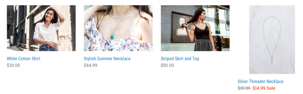
Most people gravitate toward products that look clean and aligned which can directly impact conversion rates. What do I mean by aligned? I’m talking about the rows of products displayed on a page where all the photos look to be in a straight line.
Nice and tidy
Ok I know I have my moments where things need to be perfectly aligned.
I’ve been known to line up my skittles in order of the rainbow, each color in its own column. No one else does this? Just me?
In reality, uniformity does matter to customers visiting your store. Our eyes are drawn to nice lines, clear white space and symmetrical shapes. When things look out of wack, it’s much harder to focus.
Do you agree?
Unfortunately, many themes publish what works for most stores. Most focus on the width of a product image and text and less on the height.
This makes sense when you think about it. It’s harder to make all your photos horizontal or photos that are only 600px by 600px (as an example). If you’re a photo expert (or have one at your disposal) they can certainly alter each image to be a specific dimension.
Use Consistent Images
By far, the easiest solution is to use consistent sizes in your images. Use only horizontal images (or vertical, the point is to pick one).
If you already have a horizontal image but that’s not showing, make sure it’s the first picture in your product media. More often than not, the first picture is the one that displays.
Character Limits
Another big factor in height is the amount of text in your product title. The more characters in your title, the longer the block is, the taller your product view will be.
Try limiting yourself to a specific character limit based on how much space you have. You’ll need to play with this to see what the right character amount is for both mobile and desktop views.
With that said, this isn’t always feasible. Getting all your product titles to be 25 characters for example or less can be pretty challenging but it’s worth a try if you can.
Use CSS
What you want me to code?? No, I don’t expect you to code.
Ask your theme developer to help.
I can’t tell you the exact code unfortunately since many themes have product images in different classes or they are in different locations in your Shopify liquid files.
If you do have access to a developer or you can talk with your theme developer, it’s a possible solution.
That’s it?
Perhaps. You’ll also want to look at other text under your images such as reviews and prices and you may need to set the height here as well.
Just be careful not to provide too much space that it looks weird.
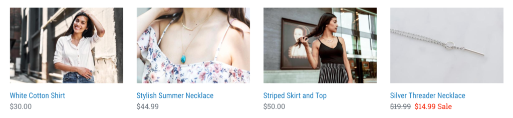
Doesn’t that look so much better! Now I feel like I can browse these products and not get anxiety.
I can’t get mine to work
Sadly, there are times we can’t make this work. Not even Amazon does it perfectly.
Some products have really long titles and some have short ones. Some have reviews, others don’t. Some have a sale, others don’t. All that impacts the height of the product image.
It is near impossible to do this across the board but you can give your best effort to be as streamlined as possible.
If you’re concerned about user experience issues like this, you might consider buying my Website Rescues. I update templates like this and clean up dozens of other problems that impact conversions on your Shopify store.
JSON-LD for SEO
Get more organic search traffic from Google without having to fight for better rankings by utilizing search enhancements called Rich Results.